Pages

Sunday, October 29, 2017

The Lincoln MKT Just Wants to Be Pretty

Since I see so many of Lincoln MKTs in New York City, I thought it would be a good subject for my third post.

I don't know whether to hate or pity this vehicle.  There's not a single line or shape that is even remotely appealing, and I blame that on the fact that, like all Lincolns, it shares it's bones with a Ford.   In this case it's the boxy Ford Flex.


The Flex debuted in 2009 and while it's not the most spectacular design, it does look as it if was designed to look that way - it all looks like it goes together.  It just happens to look like the box it was shipped in.

The MKT, however, looks like a disjointed development mule.

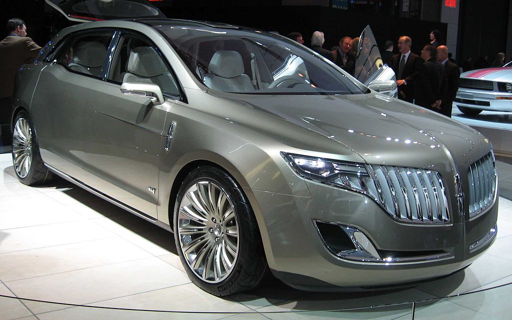
No automotive tragedy would be complete without a promising concept car.  In 2009, Lincoln debuted the MKT Concept Car, a sleek and shiny "preview" of the production model.   Naturally, when one of these concepts come out, you're hoping they won't change a thing.


And so they change everything.  And you get this:


I laughed the first time I saw this face.  And that hump on the rear quarter panel.


And nothing makes a tall rear end looks worse than horizontally stretched tail lights running across the top.  Jesus Christ.

The saddest part about this disappointing production model is how it's aged, suffering barely any updates in the 7 years that followed.  Each subsequent update gives it a sadder and more anonymous appearance.

For 2013, they drastically toned down the grille and gave the bumper a new look which further clashes with the rest of the front end. Looks like they were trying to minimize the height of the front bumper - or something.  It's awful.


And so it soldiers on, looking ugly as can be with that stupid beltline hump that serves no purpose and only makes the rear of the MKT look even fatter.  The rest of the line up gets attention, but the bastard MKT is left to languish on the back page of the Lincoln catalog.  Do they even keep one in their showrooms? 

The 2018 model just looks like a generic white refrigerator, the kind that comes in a newly renovated rental apartment.  Does that even qualify as a grille?  It's like someone just took some strips of adhesive aftermarket JC Whitney catalog chrome strips and made one themselves.

"Am I pretty yet, Mommy?"

The pic below is from the Lincoln website.  As you can see, they haven't done anything to that rear end yet.  


If the MKT wasn't forced on livery cab drivers as a replacement for the much missed Town Car, it would have been killed off by now.  It's too ugly to live.

Wednesday, October 11, 2017

The Cadillac CT6 is Almost There

Confession Time: I have a slight bias for Cadillacs.  When I was a kid, our first really "nice" car was  a 1983 Cadillac Sedan De Ville.  It had a burgundy exterior and interior and was light years away from the blue Chevy Impala before it.  When my dad brought it home, I remember sitting in it and saying, "I feel rich!"

"Oh shut up," said my sister.

Fast forward to today and I've been rooting for them to succeed since the whole Art and Science theme came into existence.

The large platform of the CT6 really takes their styling to a new level.  It's low and wide and it really has road presence.  I've seen quite few on the streets of Manhattan and I always have to stop and stare until it's out of sight.  The front end, particularly the grille and those lights, has just the right amount of aggressive styling that says, "Get out of the way, peasant."  I love this particular wheel design as well.  They really fit the car.


But it's the rear that disappoints me.  I know they are trying to hold onto their vertical tail lights, but the little kink that folds over the top of the rear fender kind of ruins the effect.  Plus, they're just too fat and blobby.  A more refined set of tail lights would have looked classier.  It's almost like they had to compromise for some reason.  Hopefully the update (inspired by the Escala concept) gives it more attitude.


The 2018 Range Rover Velar is Sleek

This is the 2018 Range Rover Velar.  While I'm not really into the whole crossover craze, I love what they did with this.  People throw the word "sleek" around a lot when describing cars, but the profile really does it for me.


The upward curving lower body line, coupled with the thin horizontal lighting really come together to give it a sense of motion.  The black upper body was a great decision too, since most crossovers look really clunky these days.


The door handles are motorized and sit flush with the body.  The dork in me loves them for their high tech look.  The practical adult in me says, "What if they break?"  But then again, if you can afford a Range Rover, practical is a foreign word.


Interestingly, this rear view reminds me of those aftermarket padded roofs from the 70s and 80s.


Here's a shot of the interior.  I'm still not sold on the touch screen craze that's taking over design these days.  I'm still getting used to the touch screen on my office copier.  

2020 Kia Telluride

The 2020 Kia Telluride SUV has arrived, two years after the concept.  It's pretty disappointing all around.  Where the concept had a mor...